How to Build a Unified Marketing Dashboard
How to Build a Unified Marketing Dashboard
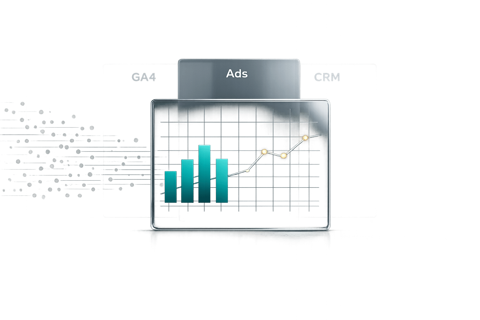
Creating a unified marketing dashboard solves the challenge of scattered data across tools like Google Analytics, Facebook Ads, and CRM systems. It centralizes your metrics, enabling faster decisions, reducing manual tasks, and improving marketing efficiency. Here's how you can build one:
- Define Key Metrics: Focus on actionable KPIs that align with your business goals, like CAC, LTV, or conversion rates. Keep it simple - track 5-10 metrics per dashboard.
- Integrate Data Sources: Start with core platforms like Google Analytics, advertising tools, and your CRM. Use a phased approach to connect additional tools.
- Choose the Right Platform: Options range from Looker Studio (free, Google-friendly) to Tableau (advanced analytics). Pick one that suits your team's needs and skills.
- Design an Effective Layout: Use the 5-second rule - key insights should be clear instantly. Prioritize metrics visually, group related data, and select appropriate chart types.
- Automate Updates: Set up automated data feeds and schedule refreshes to keep insights current. Verify accuracy regularly to maintain trust in your data.
- Test and Refine: Gather feedback, track engagement, and remove unused metrics. Regular updates keep your dashboard relevant and decision-focused.
A well-built dashboard connects marketing activities to revenue, eliminates data silos, and empowers teams to act on real-time insights.
6-Step Process to Build a Unified Marketing Dashboard
Marketing Dashboards Tutorial: Everything You Need to Get Started
sbb-itb-63525a7
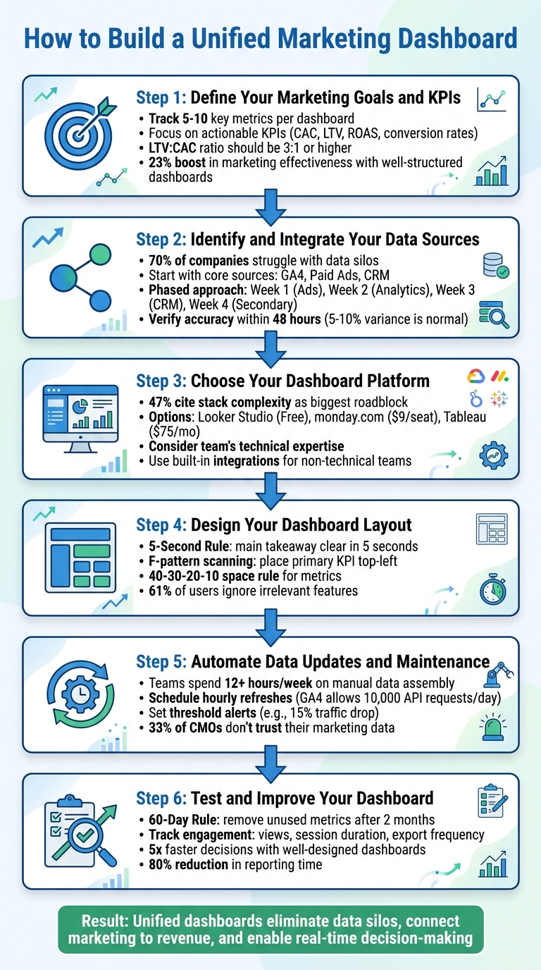
Step 1: Define Your Marketing Goals and KPIs
Before diving into data sources, you need to figure out which metrics matter most. The key is to focus on numbers that drive action. Ask yourself: if a specific metric changes suddenly, will it lead to an immediate response? This question separates a functional dashboard from one that's overloaded with unnecessary data.
Your metrics should align with your business goals. For example, if you're a startup aiming for growth, Customer Acquisition Cost (CAC) and Customer Lifetime Value (LTV) should be your top priorities. A solid LTV:CAC ratio is typically around 3:1 or higher. On the other hand, if revenue efficiency is your focus, metrics like sales velocity and conversion rates become essential. Once you’ve nailed down your priorities, you can zero in on metrics that provide actionable insights.
Here’s why this matters: companies that use well-structured marketing dashboards report a 23% boost in marketing effectiveness and a 15% lift in campaign performance. But there’s a catch - these results happen when dashboards are simple and focused. High-performing dashboards usually track just 5 to 10 key metrics, not 50.
Choose Your Primary Metrics
Your primary metrics should directly connect your marketing efforts to revenue. For instance, Return on Ad Spend (ROAS) - calculated as revenue divided by ad spend - shows whether your paid channels are delivering results. Another key metric is conversion rate, which you calculate as (conversions ÷ visits) × 100. Conversion rates above 2–3% are generally solid, but if yours is under 1%, it’s time to revisit your landing pages.
Don’t overlook metrics that reflect long-term performance. For example, churn rate, calculated as (lost customers ÷ total customers) × 100, tells you if you’re holding on to the customers you worked hard to win. Similarly, sales velocity measures how quickly deals move through your pipeline, offering insights into your sales efficiency.
Customize Metrics for Different Teams
Not everyone in your company needs the same data. Tailored dashboards help ensure each team sees only what’s relevant to their role, avoiding data overload.
| Stakeholder | Key Metrics |
|---|---|
| CEO / C-Suite | Revenue, CAC, LTV, Marketing Contribution to Revenue |
| Marketing Director | Budget vs. Spend, Total Leads, Blended CAC, Channel ROI |
| Channel Manager | CPL, CTR, Conversion Rate by Channel, ROAS |
| Specialist | Keyword Rankings, Email Open Rates, Ad Frequency |
This tiered approach ensures that every team has access to the data they need while maintaining a unified source of truth across the organization. At BrandMultiplier.ai, we use our Narrative OS methodology to refine KPIs in real time, applying these principles to keep metrics meaningful and actionable.
Establishing clear KPIs is the first step in building a foundation for integrating data sources later in the process.
Step 2: Identify and Integrate Your Data Sources
Once your KPIs are defined, it’s time to connect your marketing data platforms. Did you know that 70% of companies struggle with data silos, leading to analysts spending 30% of their time on manual tasks? That’s a huge chunk of time wasted that could be better spent on uncovering insights. Starting with just your core data sources makes the process manageable and lays a solid groundwork for actionable insights.
Start with Core Data Sources
To begin, focus on the essentials: Website Analytics (like Google Analytics 4), Paid Advertising Platforms (Google Ads, Meta Ads), and CRM Systems (Salesforce, HubSpot). These tools give you a clear picture of where your visitors are coming from, how much you’re spending to acquire them, and whether they’re converting into paying customers. Once these are in place, you can add other sources - like email platforms, social media tools, or call tracking systems - down the line. The goal is to start simple and build a dependable data foundation.
Key Platforms to Connect First
- Google Analytics 4 (GA4): This is your go-to for tracking user behavior and conversion events on your website. From pinpointing which pages drive the most conversions to identifying drop-off points, GA4 is indispensable.
- Advertising Platforms (Google Ads, Meta Ads): These platforms let you measure ROI and track performance for your biggest ad spends.
- CRM Systems (Salesforce, HubSpot): Integrating your CRM closes the loop by tying leads directly to revenue, giving you a full picture of your marketing efforts.
Since each platform uses its own data format, you’ll need to standardize things. For instance, rename fields like “Cost” in Google Ads and “Spend” in Meta Ads to a unified term like “Spend.” Similarly, align attribution windows (e.g., 7-day click) across platforms to ensure accurate cross-channel comparisons.
Here’s an example: AdCellerant initially spent six months and $120K developing custom data connectors. By switching to Improvado's pre-built connectors, they slashed infrastructure costs by 70% and significantly reduced reporting delays.
Take a Phased Approach to Integration
Trying to connect all your data sources at once can lead to chaos. Instead, use a phased approach to ensure accuracy and avoid unnecessary complexity. Here’s a suggested timeline:
- Week 1: Start with your top advertising platforms, such as Google Ads, Meta Ads, and LinkedIn.
- Week 2: Add website analytics tools like GA4 and Search Console.
- Week 3: Bring in your CRM to track how leads convert into customers.
- Week 4: Finally, integrate secondary sources like email platforms (e.g., Mailchimp) and call tracking systems.
This gradual rollout also gives you time to implement consistent UTM parameters across all campaigns. With consistent UTM tracking, you’ll be able to trace every lead in your CRM back to the exact ad or campaign responsible for the conversion.
Verify Accuracy Early On
In the first 48 hours after connecting each data source, compare the numbers in your dashboards to the native reports. A small variance (5–10%) is normal because of differences in tracking methods. However, larger discrepancies could signal issues like mismatched time zones or attribution errors. Addressing these early ensures your data is reliable, giving you a unified view for better decision-making.
Step 3: Choose Your Dashboard Platform
Now that your data sources are connected, it's time to pick the platform that will bring all that information to life. The right choice depends on your team's needs and technical expertise. Standalone BI tools like Tableau offer extensive customization options but often require skilled analysts to manage them. On the other hand, integrated platforms like monday.com or HubSpot make it easier for marketing teams to act directly from the dashboard without needing a data specialist.
Nearly half (47%) of marketing decision-makers identify stack complexity and integration issues as the biggest roadblocks to getting value from their tools. If your team lacks dedicated analysts, look for platforms with drag-and-drop interfaces and pre-built templates. Save enterprise-grade BI systems for situations where advanced statistical modeling is essential.
Compare Dashboard Tools
Once you’ve outlined your needs, it’s time to evaluate different dashboard tools. Here are a few options to consider:
- Looker Studio: Perfect for small teams already using Google products. It’s free and integrates seamlessly with Google’s ecosystem, making it a great starting point for teams creating their first unified dashboard.
- monday.com: Starting at $9 per seat per month, this platform connects data to your daily workflows, helping teams identify trends and adjust processes in real time.
- AgencyAnalytics: Designed for agencies managing multiple clients, this tool offers white-label reporting starting at $59 per month. It’s easy to set up and doesn’t require technical expertise.
- Tableau: At $75 per month, Tableau is ideal for deep analytical exploration. However, it requires SQL knowledge and some data preparation before you can create visualizations.
- DashThis: Starting at $49 per month, DashThis excels at automating routine reports and includes over 30 native integrations.
"Decisions shouldn't wait on manual report pulls or fragmented dashboards. Real-time clarity lets teams spot trends early, course-correct fast, and justify strategy with confidence."
Here’s a quick comparison to help you decide:
| Tool | Best Use Case | Key Feature | Pricing (Starting) |
|---|---|---|---|
| Looker Studio | Google-centric SMBs | Native Google integrations | Free |
| monday.com | Workflow-connected reporting | Links data to daily tasks | $9/seat/mo |
| Tableau | Deep analytical exploration | Advanced statistical modeling | $75/mo |
| DashThis | Automated routine reporting | 30+ native integrations | $49/mo |
| AgencyAnalytics | Marketing agencies | White-label client reports | $59/mo |
Select Your Integration Method
Once you’ve chosen a platform, the next step is to connect your data sources. Most platforms offer two main methods for integration:
- Built-in Integrations: These are the easiest to use, requiring just a one-click OAuth authorization. They’re ideal for non-technical teams, as they eliminate the need for coding and reduce the risk of errors. Many platforms provide pre-built connectors for popular tools like Google Ads, Meta Ads, and Salesforce.
- APIs: If you need to pull data from custom sources, APIs give you the flexibility to do so. However, they usually require developer support for setup and ongoing maintenance. APIs are often the go-to option for proprietary CRMs or niche advertising platforms.
For most small and medium-sized businesses, built-in integrations will cover the majority of needs. Start by connecting your core platforms like Google Ads, GA4, and your CRM. Save API development for unique data sources that truly warrant the extra investment. With your platform and integrations in place, you’re ready to design a dashboard that delivers actionable insights.
Step 4: Design Your Dashboard Layout
Now that you’ve chosen your platform and set up integrations, it’s time to design a layout that’s easy to grasp at a glance. A good rule of thumb? Use the 5-Second Rule: your dashboard’s main takeaway should be clear within five seconds. To achieve this, place your most important KPI where it naturally catches the eye.
Organize Metrics by Priority
Your layout should reflect the priorities you’ve already established. Research shows users scan dashboards in an F-pattern - starting at the top-left, moving right, and then down the left side. So, place your primary KPI in the top-left quadrant, where it will grab 80% of the user's attention. To make this metric stand out, size it 2–3 times larger than secondary metrics and use bold text for emphasis.
Follow the 40-30-20-10 space rule when allocating screen space:
- 40% for your primary KPI (e.g., Total Revenue or CAC)
- 30% for 2–3 secondary KPIs (e.g., ROAS or conversion rate)
- 20% for trend charts to provide context
- 10% for navigation or filters
Keep the total number of metrics manageable - 5 to 9 per screen. Displaying more than 12 KPIs can overwhelm users, leading to a 40% drop in engagement.
To make the information flow better, group related metrics by themes like marketing channels, funnel stages, or customer journey phases. For instance, cluster all SEO-related data together or organize metrics by stages such as Awareness, Consideration, and Conversion. Before jumping into dashboard software, sketch your ideas with tools like Miro or Canva.
Choose the Right Visualizations
Picking the right chart type is just as important as the data itself. Avoid 3D and dual-axis charts - they can distort your data and make it harder to interpret. Instead:
- Use line charts for trends, as they make changes easy to spot.
- Opt for horizontal bar charts when comparing 2–7 categories, as length comparisons are more intuitive than angles.
- Skip pie charts with more than five slices; stacked bars or treemaps work better for showing proportions.
- Rely on heat maps to highlight patterns across large datasets using color.
Always provide context for your metrics. A number without comparison - like a previous period or a goal - lacks meaning.
Make your visuals accessible by testing them in grayscale or using colorblind-friendly palettes with at least a 3:1 contrast ratio. Since about 8% of males have color vision deficiency, avoid relying solely on red and green to indicate performance. Add icons, like arrows, or use alternative color combinations to ensure clarity. Well-chosen visuals make your data easier to understand and act upon.
Build Role-Specific Views
Dashboards aren’t one-size-fits-all. Studies show 61% of users ignore features irrelevant to their role. To avoid clutter and confusion, create tailored views for different stakeholders based on their needs:
- Executives need high-level metrics like ROI and CAC, updated weekly or monthly for strategic decisions.
- Campaign managers require daily updates on tactical metrics like CPL and ad spend pacing for optimization.
- Specialists need granular details, such as keyword performance or A/B test results, updated hourly for immediate action.
Each metric should drive a specific action. If a user doesn’t have the authority to act on a metric, consider moving it to a different view tailored to the appropriate role. Use role-based access controls to direct users to their relevant dashboards automatically, simplifying their experience. Companies that implement role-specific dashboards often make decisions five times faster than those using generic layouts.
"The best metric is one that forces a change in behavior. If the metric doesn't change how you act, it's just a number taking up space on a screen." - Avinash Kaushik, Author and Analytics Expert
Step 5: Automate Data Updates and Maintenance
With your dashboard ready, automating data updates is the next step to ensure your insights stay relevant and actionable.
A dashboard is only as good as the data it displays. Relying on manual updates not only eats up valuable time but also increases the risk of errors. In fact, teams can spend over 12 hours a week just assembling data. Automation solves this by pulling in fresh data automatically, allowing you to focus on analysis and decision-making rather than wrestling with spreadsheets.
Set Up Automated Data Feeds
Start by connecting your data sources using pre-built connectors or APIs. This eliminates the need for manual CSV uploads. Most dashboard platforms come with built-in integrations for tools like Google Ads, Meta Business Manager, and Google Analytics 4 (GA4). If a direct connection isn’t available, platforms like Supermetrics, Funnel.io, or Dataslayer can bridge the gap, handling API changes and standardizing data formats for you.
To keep your data timely, schedule hourly refreshes. This ensures your insights are up-to-date while staying within API rate limits - GA4, for example, allows up to 10,000 API requests per day. Scheduling updates during off-peak hours can also improve dashboard performance, ensuring it’s ready when your team starts their day.
Consider setting up threshold alerts to flag potential issues. For example, you could receive a notification if organic traffic drops by 15% week-over-week or if CPC increases by 20% compared to the 30-day average. Additionally, use auto-retry mechanisms with exponential backoff to handle temporary connectivity issues.
Before connecting all your data sources, establish consistent naming conventions for campaigns and UTM parameters. This step reduces the need for manual data cleanup later. Finally, include a "last updated" timestamp on your dashboard to build user confidence in the data’s freshness.
Once your automated feeds are in place, focus on maintaining the accuracy and reliability of your data.
Maintain Data Quality and Accuracy
During the first 48 hours, compare your dashboard metrics with data from native platforms to check for discrepancies. A 5–10% variance between platforms (like Google Ads clicks versus GA4 sessions) is normal due to differences in tracking methods, but larger gaps may signal an issue.
Conduct regular audits to confirm your integrations are working properly. This is especially important as more than 33% of CMOs admit they don’t fully trust their marketing data. Keep a record of each platform’s metric definitions, as these can vary and lead to confusion.
"The current state is defined by a multitude of data silos... These characteristics lead to ongoing issues, such as slow time to market, low productivity and poor self-service." – Gartner
To improve performance and reduce API strain, use data caching to store processed information instead of pulling raw data every time the dashboard loads. During data loading, consider displaying placeholders to signal that the dashboard is updating.
Lastly, implement clear data governance policies. Define who can modify dashboards, access sensitive KPIs, or approve changes to metrics. Organizations with well-maintained dashboards often see a 23% boost in marketing effectiveness and a 15% improvement in campaign performance. Treat your dashboard as an evolving tool that requires ongoing care to deliver reliable insights over time.
Step 6: Test and Improve Your Dashboard
Your dashboard is up and running, but the journey doesn’t end here. If it doesn’t lead to actionable decisions, it risks becoming just a collection of unused visuals.
Start by gathering feedback from your team with specific questions like, “Is there a metric you need that’s missing?” or “Are any of these visualizations unclear?”. You can also track user engagement through metrics like views, session durations, and export frequency. For example, if 72% of users are exporting data to Excel, it’s a sign your dashboard might not be meeting their needs directly.
Once you’ve collected meaningful feedback, refine your dashboard continuously. Follow the 60-Day Rule: if a metric or visualization hasn’t influenced any decisions in two months, remove it. To keep your dashboard in sync with your business goals, perform a comprehensive KPI review every quarter.
Analyze Dashboard Insights
A functional dashboard should meet the 5-Second Rule - executives should understand the key performance story within five seconds of viewing it. If this isn’t happening, consider reworking the layout. Place the most critical KPI in the top-left corner, as this is where attention naturally gravitates.
Your dashboard should drive immediate decisions. For instance, if an ad group’s cost per acquisition goes above target, pause it. If one type of content consistently delivers better conversions, adjust your budget to capitalize on it. These real-time actions ensure your dashboard remains a tool for decision-making, not just reporting.
"A good dashboard doesn't just show data - it shows direction." – Sean Dougherty, Senior Brand Creative, Funnel
Dashboards are evolving from static reports to predictive tools. Instead of only reviewing past performance, use your data to forecast ROI and identify potential risks early. Features like AI-powered anomaly detection can highlight unexpected spikes or dips, turning your dashboard into a proactive alert system that supports your strategic goals.
Create Regular Reporting Schedules
Beyond live testing, set up a consistent review process to keep your dashboard relevant. Schedule a weekly 30-minute meeting with stakeholders to go over the dashboard and document any actions taken based on its insights. This habit ensures data-driven decisions happen regularly. In fact, companies with well-designed dashboards often make decisions five times faster and reduce reporting time by up to 80%.
Different audiences will need different review schedules. Executives might focus on metrics like revenue, ROI, and CAC on a monthly or quarterly basis, whereas channel managers might require daily or even hourly updates. Specialists running A/B tests may need real-time data during active campaigns.
Consider structuring your dashboard with high-level summaries linked to detailed channel pages. This setup allows executives to see the big picture while giving managers the ability to drill down into specifics. Additionally, fostering close collaboration between CMOs and CFOs - often through shared financial dashboards - can lead to financial performance improvements of 20% to 40%.
Conclusion
Create a centralized marketing dashboard that pulls scattered tools into a single, real-time view of your data. When implemented effectively, automated dashboards can save hours by replacing manual data extraction with streamlined processes.
Make sure your dashboard links tactical actions - like clicks and leads - to overarching goals such as revenue, customer acquisition cost (CAC), and return on investment (ROI). This approach shifts marketing from simply reporting numbers to actively driving data-informed growth.
Automation plays a key role here, eliminating manual data tasks and minimizing errors with automated feeds and alerts. This not only boosts operational efficiency but also frees up your team to focus on strategic, high-value activities instead of repetitive data entry. Plus, real-time insights enable you to spot underperforming areas and adjust budgets immediately - no need to wait for end-of-month reports. With this setup, you’re equipped to make quick, informed decisions.
Tailor your dashboard to support decision-making at every level. Include role-specific views that provide executives with ROI summaries, managers with operational metrics, and specialists with detailed channel data. Add comparison tools, like "this month vs. last month" or "actual vs. budget", to ensure the metrics are actionable.
As your business evolves, so should your dashboard. Regular updates, testing, and feedback ensure it stays aligned with your goals. A unified dashboard also fosters collaboration across teams like marketing, sales, and finance. By working with consistent data, you eliminate disputes over numbers and encourage teamwork that drives growth. Clearly, unified dashboards are essential for breaking down data silos and unlocking growth potential.
FAQs
Which KPIs should I put on my unified dashboard first?
Start by focusing on KPIs that tie your marketing efforts directly to business results. Key metrics like Customer Acquisition Cost (CAC), Return on Ad Spend (ROAS), and Customer Lifetime Value (LTV) are vital. These figures provide insight into how efficiently your campaigns are running and how profitable they are, giving you the data needed to make smarter decisions.
How do I match data across GA4, ad platforms, and my CRM?
To ensure your data aligns across GA4, ad platforms, and your CRM, it's essential to bring these sources together into one cohesive system. This approach allows for consistent tracking and attribution. Here's how to make it happen:
- Gather data: Use APIs or connectors to pull information from GA4, ad platforms, and your CRM into a central location.
- Standardize formats: Align data structures and attribution models to ensure consistency across all platforms.
- Create a unified view: Build a single dashboard where you can visualize performance metrics and customer journeys in one place.
By following these steps, you'll gain a clearer picture of your marketing efforts and their impact.
How often should my dashboard refresh for real-time decisions?
For effective real-time decision-making, your marketing dashboard needs to refresh often enough to deliver timely insights. Ideally, this involves updates happening in real-time or close to it. The specific refresh rate depends on your goals, but most dashboards are designed to update continuously or at least multiple times per hour. Automated updates play a crucial role in keeping data accurate and enabling quick adjustments when needed.
Ready to transform your brand story?
Schedule a free diagnostic to see how we can help.
Schedule The Diagnostic